
Get ready for a little data overload. I’ve been swimming through Census data ever since the 2012 American Communities Survey data came out and showed that biking, walking and transit use in Seattle is way up.
But what about the rest of the region? As several readers have pointed out, Seattle’s plummeting rate of driving alone to work is great, but the region is still very car-dependent. Well, let’s look at some data, shall we?
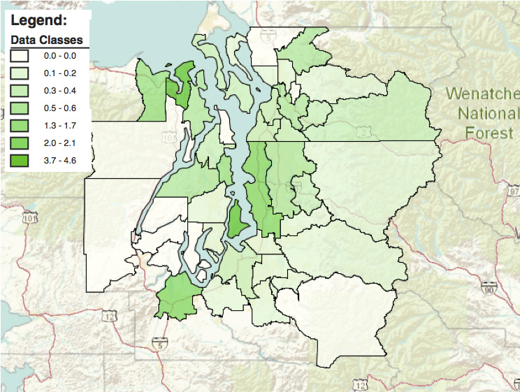
First up, check out the map above. It’s from 2011 data (I couldn’t find the 2012 data, if it even exists at this granular level), but it gives you an idea of what other parts of the region are seeing high rates of cycling to work. Outside of Seattle, Vashon and Port Townsend really stand out. Olympia, Bainbridge and really most of Kitsap County ain’t too shabby, either.
In fact, at 6.2 percent, Port Townsend might be the region’s bike commute leader (but less than 2 percent take transit, suggesting the area has a ton of room to reduce its driving rate if it would just invest in the transit system).
Vashon Island’s bike commute rate also tops Seattle, with 4.6 percent of island residents biking to work. In fact, only 54 percent of Vashon residents drive alone to work.
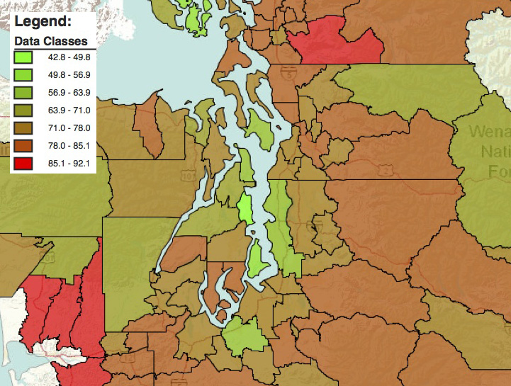
Here’s a look at driving alone rates around the region (again, 2011 data):
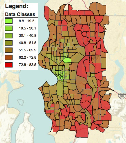
 On a more granular level, below are driving alone rates for Census blocks in Seattle and its near suburbs (again, 2011 data). Amazingly, much of central Seattle actually has driving rates lower than 30 percent. Perhaps not surprising, the most car-dependent areas in the near-suburbs are along the I-405 corridor.
The 520 Bridge is a huge barrier to commuting by any mode other than a car. In a stark demonstration of this, the neighborhood around the west end of the bridge has driving rates around 10 percent, while neighborhoods around the east end of the bridge has driving rates around 80 percent. In the I-90 corridor, which has much better express transit and biking infrastructure compared to 520, the difference is a bit less dramatic.
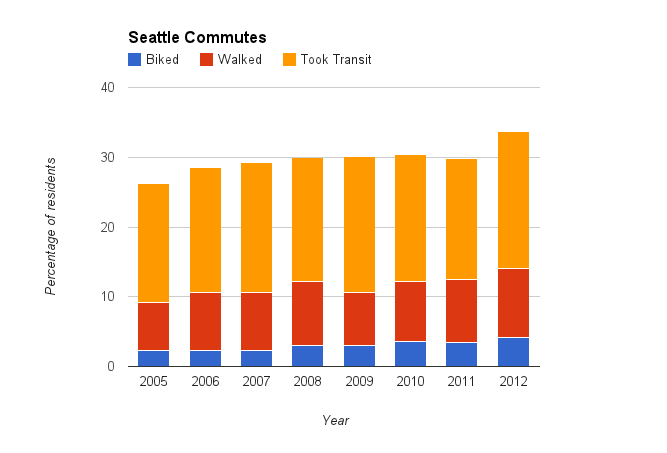
 So that’s a look at where things are. But where are they headed? Here’s a visual look at the Seattle commute data we have discussed previously:
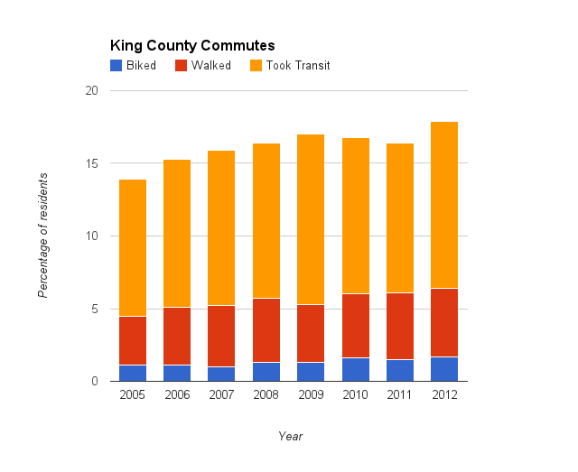
 As the next graph shows, Seattle is not alone. King County as a whole is seeing similar increases in biking, walking and transit use:
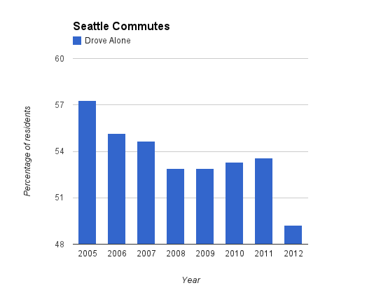
 Here’s a look another look at the decline in driving alone to work among Seattle residents:
 King County saw a very similar decline in the rate of residents driving alone to work, though slightly less dramatic than in Seattle:
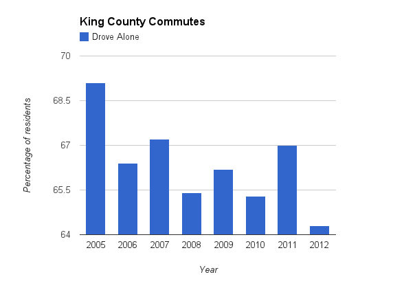 But since Seattle’s decline in driving is captured in the King County results, this shows that the rest of the county is lagging behind in the effort to move away from dependence on personal cars.
You can dig through my spreadsheet of King County commute data going back to 2005 here. Seattle commute data (2005-2012) is here. If you want to dig through Census data, here’s the somewhat confusing Census website.
Notice anything else interesting in all this data? Let us know in the comments.
UPDATE 1:40PM: I updated the graphs above to be more technically accurate (I used curvy line graph, though readers suggested bar graphs would be more appropriate).
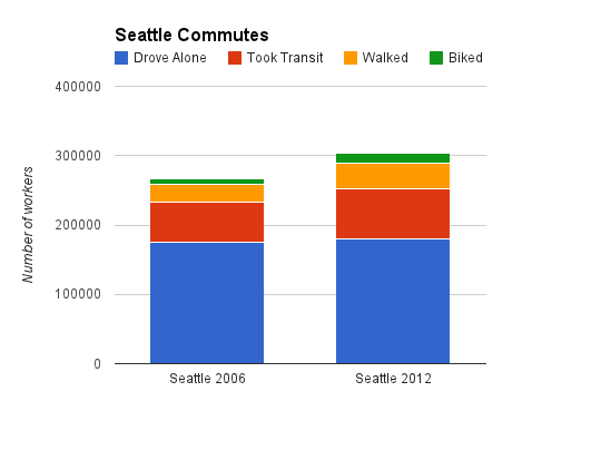
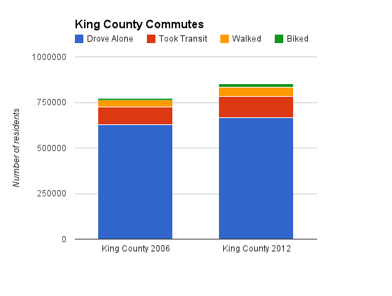
Also, in answer to Zach’s question in the comments below, here are graphs analyzing the raw numbers of residents using each transportation mode. They reveal that as the population (technically, workforce) grows, the total number of people driving to work remains fairly unchanged. The number did grow, but the vast majority of the new commute stress is being absorbed by biking, walking, transit and telecommuting (not included in the graphs because it’s not a road use).


Comments
17 responses to “Not just Seattle: King County is also driving less + A look at biking rates around Puget Sound”
All these posts about commute rates are fantastic and exciting, but I’d like us to be able to address total volume too. In a growing city, it may very well be the case that total driving is up even as its share of the total declines, simply due to even faster growth in other modes. As an silly example, say we added 100,000 people next year, all of whom magically teleported to work. The drive-alone commute rate would plummet, but total congestion would stay the same as it is today, as would my experience interfacing with cars, bikes, and people on foot. Would it be statistically valid to apply these modal percentages to regional estimates of population and employment to infer total volume by mode?
That data does exist in the Census survey. When i get back to my computer, i’ll look into it. Or, if one of y’all wants to take a crack at it, click the Census link at the bottom of the post and see if you can find it (warning, site is a bit confusing)
Zach, I added graphs trying to answer your question. It appears that bike/walk/transit are absorbing the added commute trips. See update above
Thanks Tom, that’s exactly what I was looking for. I think it’s important to use the raw volume to tell the story that cars will always suck up available road capacity (see The Efficiency Paradox), and that we shouldn’t really ever expect congestion relief due to lower driving modesplits. (Seattle Times commenters love to say, “But I’m stuck in traffic, so this data is BS!”)
But this also allows us to tell the awesome true story that nearly 100% of new growth is going to walking, bicycling, and transit.
Thanks again for updating the post. Awesome work.
I posted in another recent thread (with day old comments), but I’m curious how city and county spending compare to shares of each commuting mode (and to overall trips). Is that data that is readily available?
Your graphs are very misleading. You only have discrete data points for each year, not continuous data.
You should be using bar charts.
Was not my intention to mislead, but now i just read up on splines and discrete data and see you’re probably right. I’ll redo them when I get back to my computer.
Wondering how and what time of year these surveys are conducted and how their accuracy can be assessed. I imagine that biking (especially) and also walking and taking transit rates are much higher in nice weather than in our wet/cold/dark winters.
This data looks very suspect. For example, how do you explain, in the King Co. drive alone % bar graph, that every other year the percentage alternated between increasing and decreasing? Why would it continually go up one year, then down the next, from 2006 to 2012? What is your explanation for that?
And in the Seattle drive alone % bar graph, why would it increase slightly every year from 2008 to 2011, then drop dramatically in 2012?
Do you have some explanations for these strange things? If not, it certainly suggests bad data. These changes in percentages might be within the range of error of the survey, in which case, they are not even real. I, for one, have never filled out an American Community Survey.
The variations year-to-year are most likely just statistical noise (as you suggest, margin of error). That’s why it’s mostly useful to look at multiple years and change over time to see the trends, which show a clear decline in the % of ppl driving alone to work and a clear increase in bike/walk/transit.
There’s a chance next year’s survey will find driving alone above 50%, but the trend suggests it continuing further down over time.
It seems pretty likely to me that the big dip in Seattle drive alone % in 2012, after being basically stable for the 4 years from 2006 through 2011 (between 55% and 53% all 6 years) was due mainly to the construction on Mercer St. and the narrowing of the Alaskan Way viaduct from 3 lanes in each direction to only 2, by the stadiums, which caused terrible congestion on SR99 every day.
This just goes to show that if you eliminate traffic lanes on major commute routes, like Mercer St. and SR99, you can force some people out of their preferred mode of transporation.
I should add the tolling of the 520 bridge, which started just a few days before the first day of 2012, also significantly reduced the number of SOV commuters using that bridge to commute to/from Seattle. That probably had more impact than the Mercer St. construction.
So, the dip in drive-alone % in 2012 was likely entirely caused by the reduction of SR99 in Seattle from 6 lanes to 4, and the implementation of tolls on the 520 bridge.
Since I commented about graph colors on the other recent post, I should point out that in this post the colors used in the graphics are very easy for me to distinguish. Even the ones that use gradients rather than highly contrasting colors (to indicate ranges of numeric values as opposed to discrete categories) also have brightness gradients, which helps me a lot.
I also like that the stacked bar charts have a thin white buffer between the different-colored sections — that helps them stand out from each other.
[…] saw an excellent post in the Seattle Bike Blog on how Seattle commutes. Which got me wondering how Mercer Island […]
[…] Blog parsed a lot of data for the past two years for Seattle and King County as a whole here and here. The Seattle Times also reported on the local […]
[…] Seattle and surrounding areas driving less – yay for us! […]